Work

04 · DESIGN HOLIDAYS · 2026 · ROLE: SOLO DESIGNER + BUILDER

A brochure trapped in PDFs, rebuilt as a way to choose a journey.

Situation
Design Holidays had an old website in shambles and a product that really lived in fragmented PDF files, one per travel plan. They wanted a quick, credible entry back into the market.
Clarity
I designed the whole thing solo and built it with AI assistance, turning scattered plans into one system: mood-led discovery on an atlas, and a single repeatable journey template behind it.
Shipped
A live eighteen-page site, five core pages and thirteen journeys, with mood-based discovery and WhatsApp-first inquiry, delivered in under a month.
Built forWebMobile

01 · The mess

The client's old site was doing them no favours, and their real product lived in PDF files emailed out one at a time.

They needed to be back in the market fast. But the problem wasn't decoration. Anyone shopping for a holiday has already seen ten identical sites, the same grid of destinations, the same stock photos, the same "book now". Nothing in a list of thirteen places tells you which one is yours.

And the business actually ran on WhatsApp, not a checkout. Building a conventional shop would have modelled the wrong thing entirely.

  1. 01Old site in shambles
  2. 02Plans trapped in fragmented PDFs
  3. 03Thirteen destinations, no way to choose
  4. 04Every competitor looks identical
  5. 05Business runs on WhatsApp, not checkout
  6. 06Quick market entry needed

02 · The work

Research

The whole brief was a stack of itinerary PDFs. There was no site to improve and no design system to inherit, so the research was competitors: what patterns travel buyers already knew, and which of them were worth borrowing rather than inventing.

  • Studied competitor travel sites for the conventions customers already recognise
  • Chose the familiar pattern over the novel one wherever both would work, speed to market was the actual requirement, not originality
  • The client already had the marketing channels; the site had to be ready to receive them

Collaboration

One document in, one site out, and everything in between was mine, with the founder as the only reviewer.

What I was given

Itinerary documents

Day-by-day text, hotels, inclusions, exclusions. A logo from the client, and nothing else, no site, no reference.

What shipped

A live booking site, on their own domain

Thirteen journeys through one template, on a domain they already owned and already marketed.

Everything between the two, mine

  • Research
  • IA
  • UX
  • UI
  • Copy structure
  • Build
  • Ship

The logo came from the client. Everything built on top of it is mine, and iterations went straight to the founder and came straight back, which is the shortest review loop on this site and the reason it reached the market quickly.

03 · The big calls

PRODUCTLens

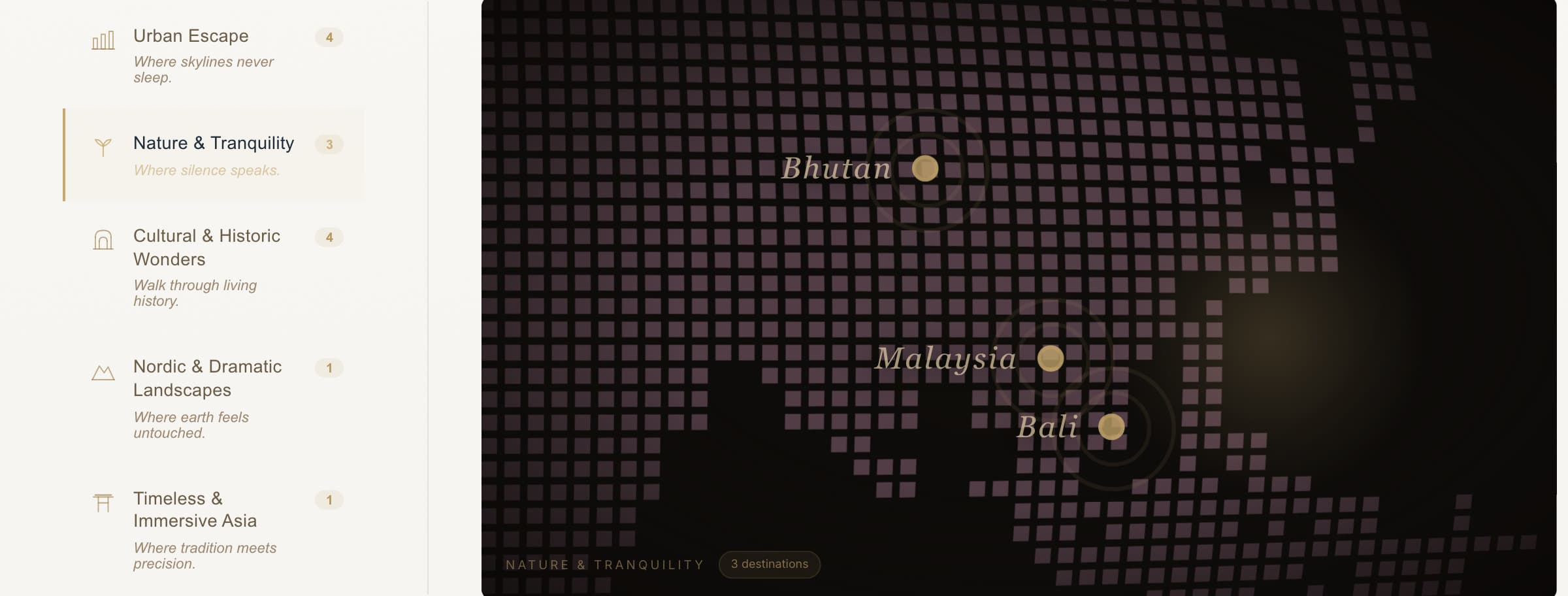
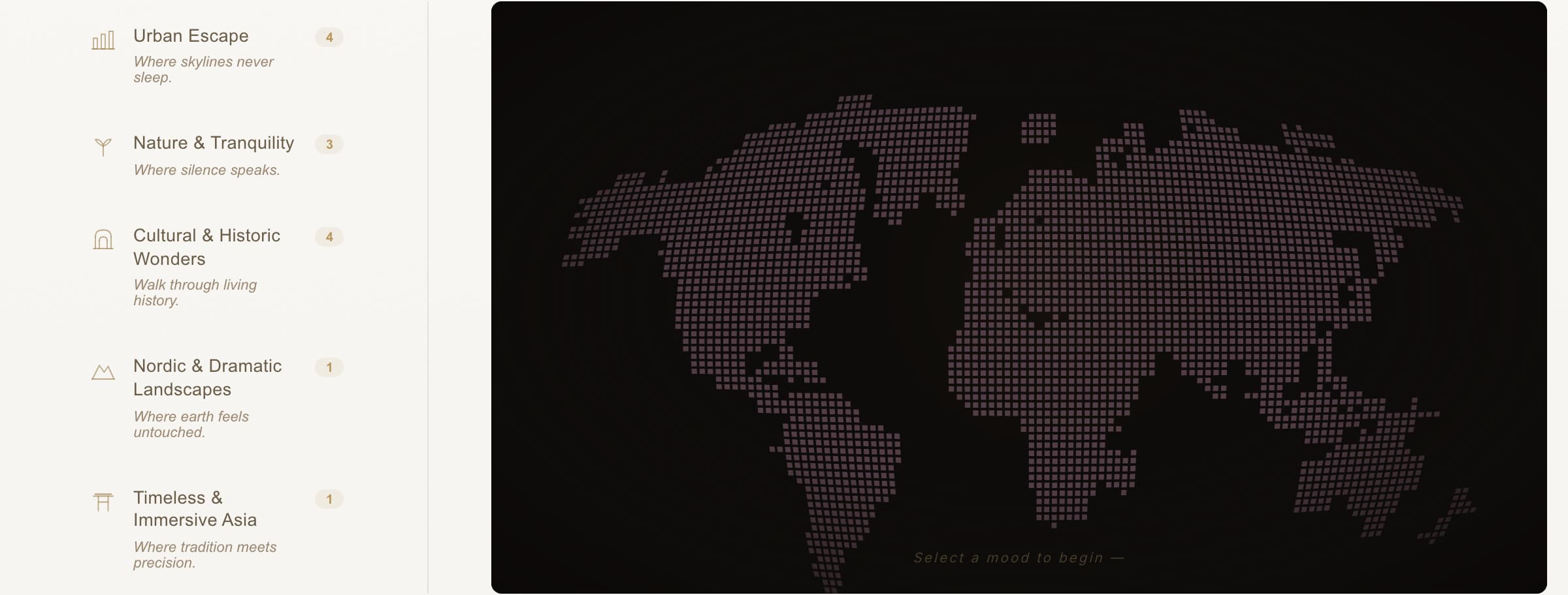
Nobody arrives at a travel site knowing the destination, they arrive knowing the feeling they want. So discovery is organised by mood, not geography. Five moods, each with a plain-language line and a live count: Urban Escape, where skylines never sleep; Nature & Tranquility, where silence speaks; Cultural & Historic Wonders; Nordic & Dramatic Landscapes; Timeless & Immersive Asia. Selecting one plots its destinations on the atlas and zooms to that region. Thirteen journeys become a choice of five, and the map does the narrowing.

BUSINESSLens

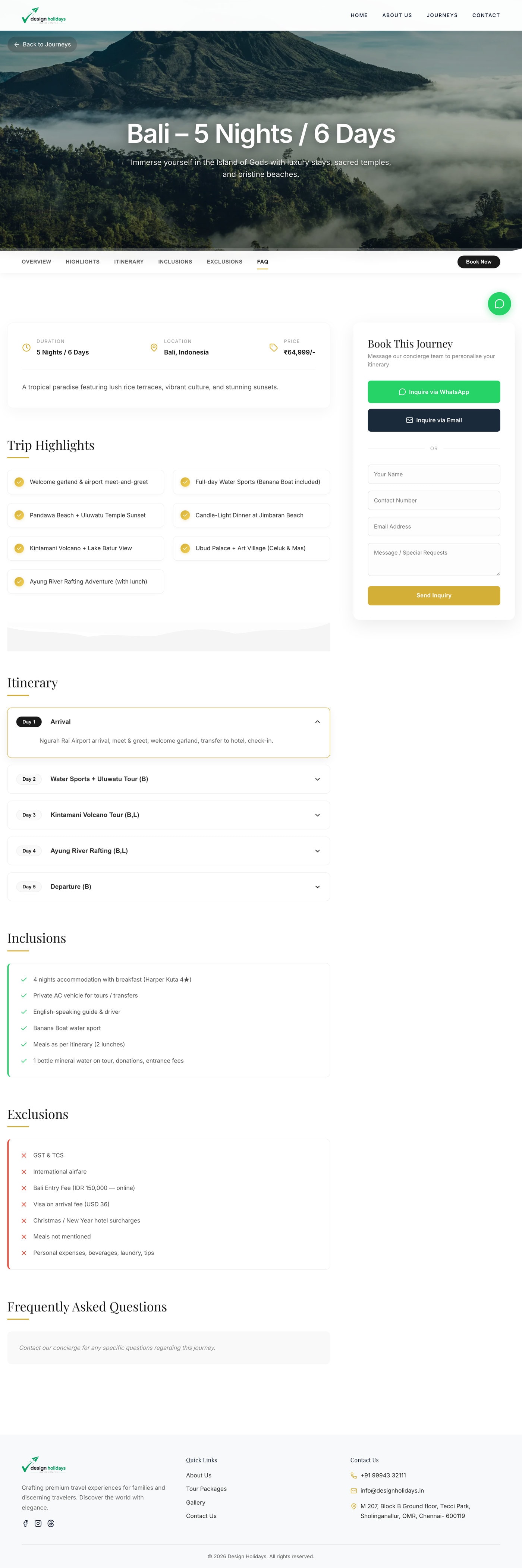
The client converts over WhatsApp, so the design makes WhatsApp the primary action instead of burying it under a form. Every journey page carries a sticky booking card: WhatsApp first, email second, and a full inquiry form for people who want to write more. Pricing sits in the open in rupees on the fact strip rather than behind a 'request a quote' wall, a boutique operator competing on service should not make the first interaction an obstacle.

EXECUTIONLens

I designed in Figma and Photoshop and built the site with AI assistance, which is why a solo project of this size shipped in under a month. That speed only worked because the design was systematised first: one journey template, hero, sticky section nav, fact strip, highlights, day-by-day accordion, inclusions against exclusions, inquiry, filled thirteen times from the client's PDFs. The template was the real deliverable; the thirteen pages were data.

04 · The build

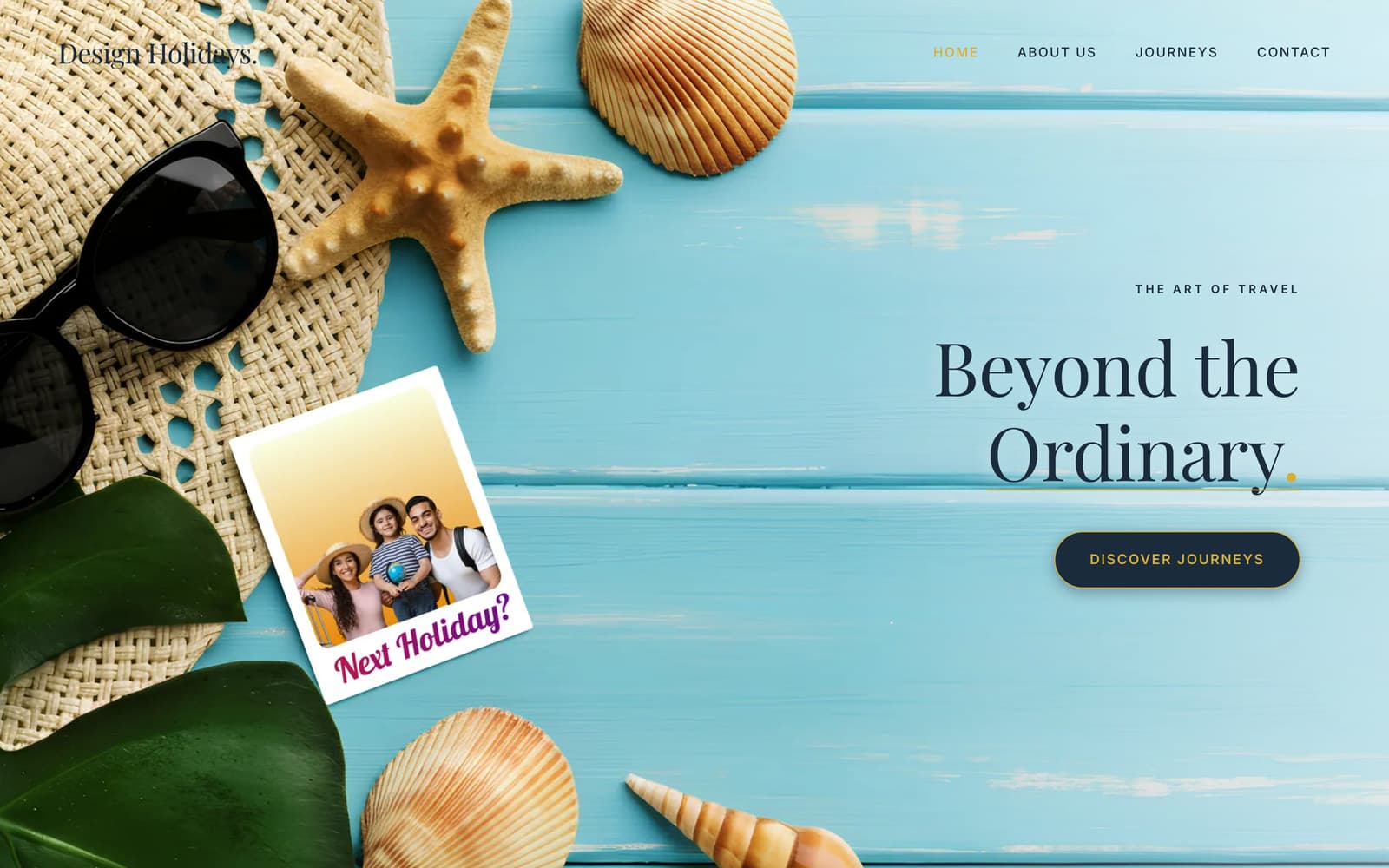
FIG 04.1
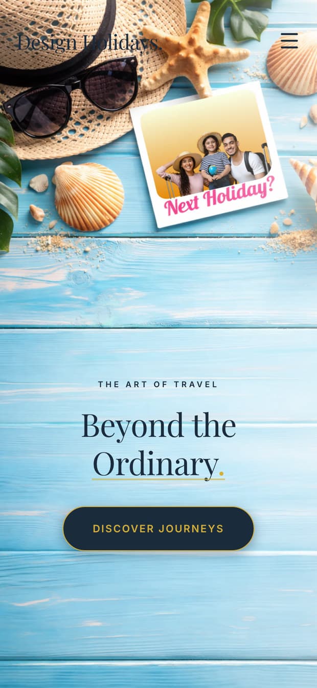
Design Holidays homepage hero, 'Beyond the Ordinary' set against a beach flatlay, with the primary call to action.
FIG 04.1 · AS SHIPPEDThe homepage. A studio, not a booking site.
FIG 04.2
The mood atlas in its resting state, showing the whole world and the prompt 'Select a mood to begin'.
Resting, select a mood to begin
The mood atlas with Nature & Tranquility selected, zoomed to Asia with Bhutan, Malaysia and Bali pinned.
Nature & Tranquility, 3 destinations
FIG 04.2 · AS SHIPPEDPick a mood. The map answers.
FIG 04.3
The Design Holidays mood selector in detail: a left rail of moods, Urban Escape, Nature & Tranquility, Cultural & Historic Wonders, Nordic & Dramatic Landscapes, Timeless & Immersive Asia, each with a destination count and a one-line description, beside a dark dotted map plotting only the chosen mood's destinations: Bhutan, Malaysia and Bali.
  1. 1 ·Sold on feeling, not geography, the premise, above the place names.
  2. 2 ·Count visible before the click: one destination is never a surprise dead end.
  3. 3 ·The map answers by subtraction, only the chosen mood is plotted.
FIG 04.3 · AS SHIPPEDThe mood selector, with the thinking marked.
FIG 04.4

From a feeling to a conversation

Thirteen travel plans, each trapped in its own PDF
One journey template, filled thirteen times
The five ways inUrban EscapeNature & TranquilityCultural & HistoricNordic & DramaticTimeless Asia
1

A mood

five ways in, a feeling, not a destination

2

The atlas

plots only that mood, zooms to the region, states the count

3

One journey

duration, location and price in the open

4

WhatsApp

the primary action, where the business already talks

Email or inquiry form

for people who want to write more

No checkout, the conversation is the conversion

FIG 04.4 · DIAGRAM · DRAWN FOR THIS PAGEHow a visitor gets from feeling to booking.
FIG 04.5
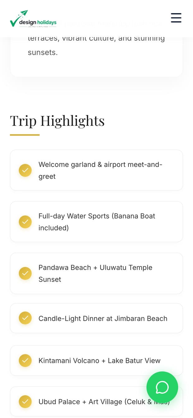
A full journey page, hero, sticky section navigation, fact strip, highlights, day-by-day itinerary accordion, inclusions, exclusions, and the sticky booking card.
scroll ↓
FIG 04.5 · AS SHIPPEDOne journey page. The template for all thirteen.
FIG 04.6
The homepage hero on mobile.

Home

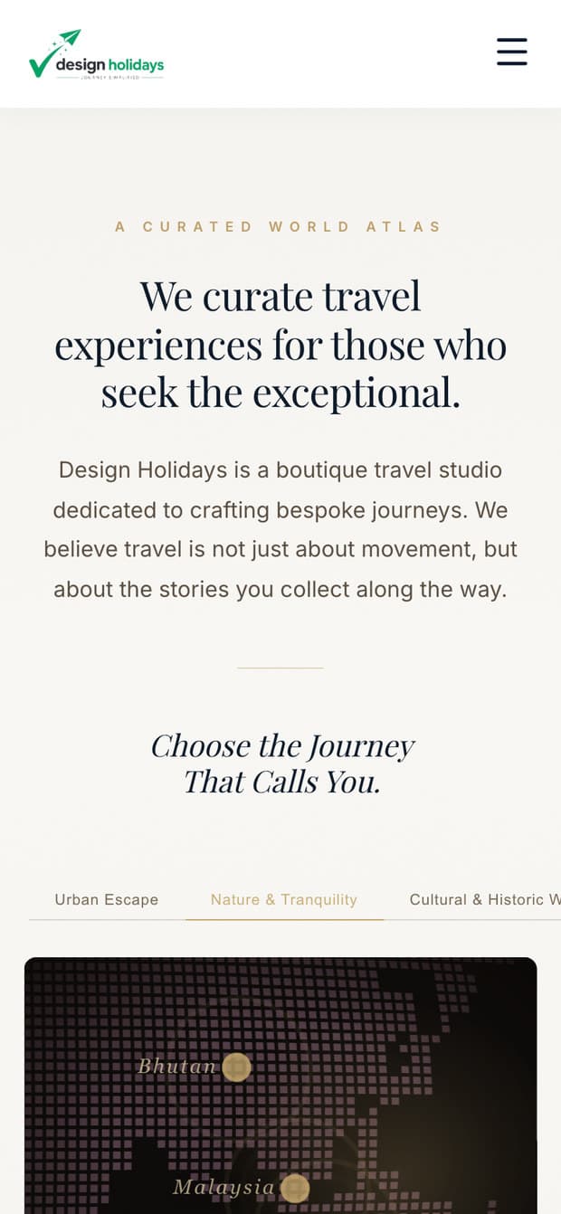
The mood atlas on mobile, with the mood list collapsed into a scrollable pill tab bar.

Atlas, mood pills

A journey page on mobile, showing the fact strip and highlights.

Journey

FIG 04.6 · AS SHIPPEDOn a phone, the moods become a swipe.

Problem → part

  • Fragmented PDF plansOne repeatable journey template
  • Thirteen destinations in a listFive moods on an atlas
  • Generic destination gridDiscovery by feeling, not geography
  • Hidden 'request a quote'Open pricing, WhatsApp-first inquiry
  • Old site in shamblesLive eighteen-page site in under a month

05 · The facts

★ Ryan Soni

Case 04 · DESIGN HOLIDAYS · 2026

<1 mo

Design → live

13

Journeys shipped

Solo

Design + build

Client / domain
Design Holidays, a boutique travel studio in Chennai, India, selling curated international journeys
Live site
designholidays.in, public; the client cleared this case study
Timeline
May 2026 → shipped in under a month
Role
Solo designer and builder, end to end
Team
Ryan solo, working directly with the client
Method
Designed in Figma and Photoshop; built with AI assistance (Antigravity). The design decisions, system, and craft are mine; the AI accelerated the code.
Scope
Five core pages and thirteen journey pages, brand application, design system, page design, responsive behaviour, and the front-end build
Starting material
Fragmented PDF files, one per travel plan, plus an old site in poor shape
Design system
Editorial serif display against a sans body, cream ground, ink navy, brass accent, chosen to read as a boutique studio, not a booking aggregator
Discovery model
Five moods → atlas pins with live counts → journey detail → WhatsApp or form inquiry
Accessibility
The mood selector is a real tab set (role="tab" / aria-selected), with a desktop rail and a scrollable mobile pill bar
· Outcome ·

The client reports that marketing drove a high volume of clicks and that business is running ahead of what they anticipated. No figures were shared with me, so none are claimed here.

None, the client approved public use of this work

06 · The takeaway

This is what I do when there is nobody to hand off to. One product call, choose by feeling, not by map. One business call, talk to people where they already talk. Live in under a month, because I built the system before I filled the pages.